Look at the apparent change in colour of the white letters and increase your distance from the screen until the letters start to dance.
sliders from top to bottom
saturation
brightness
colour sequence
frequency
The first phenomenon is the result of the assimilation effect, the second results from the separation between figure and ground and the third is triggered by the simultaneous contrast in brightness. The fifth is the result of the limitations on the temporal resolution of our visual system and the sixth is due to the improvement in our visual acuity brought about by sufficient brightness.
This basic and very common colour effect (see also Spot 09) is the result of the limited resolving power of our retina and how its receptive and perceptive fields are organised [1]. The resolving power is determined in the region of the fovea, the location of clear sight, by the density and size of the colour receptors. At the edges of the strokes of the letters, which are in reality white, the decisive neurons of the visual system receive not only the colour signal “white”, but also the additional signals for the coloured background and report to the cerebral cortex an extremely bright compound colour instead of white. The assimilation effect can only occur when the transverse measurement of the white stokes is small enough for the perceptive fields of the retina to also cover sections of the background. This effect is therefore intensified by increasing the distance between the viewer and the screen [2].
Two further examples from the book “Blau.Gelb.Rot.” [3]:
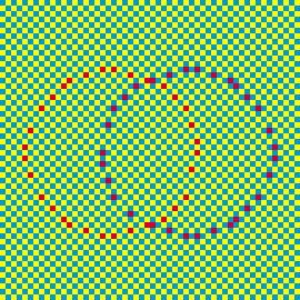
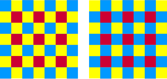
Figure 1 shows the linear assimilation effect, while the figure 2 the flat surface effect. In reality, there is only one red, although orange is perceived in the ring embedded in the yellow colour elements and violet in the ring surrounded by blue elements. Take special note of where the two rings intersect, using a magnifying glass if necessary.
In figure 2, too, there is just one white. The influence of neighbouring colours is always mutual; the yellow and blue colour elements of the two squares are therefore also lit up by the white and change colour accordingly.
Do not confuse the assimilation effect with the Bezold effect or with the colour simultaneous contrast.
As soon as the colour elements are larger in size, the so-called Bezold effect dominates; this was shown and explained in Spot 01, Spot 07, Spot 08, Spot 09. There still remains speculation today as to the reasons behind this macroscopic effect.
If the colour elements are embedded in a homogeneous background, however, the colour simultaneous contrast is created which is the reverse of the Bezold effect; this is shown in Spot 20, Attacke 3 and also mentioned in Spot 07.

If you increase the image frequency, the phantom colours grow pale and eventually vanish completely. The image frequency must therefore not be too high if each individual image and the colour effects that exist in it. The image data require sufficient time (more than 50 milliseconds) to reach the cerebral cortex, where perception can take place. An image frequency of less than 20 Hertz must therefore be selected if the magic interplay of colour is to be unleashed. See how the colours of the neighbouring stripes, which supply the “colorant” for the apparent alterations in colour change with the shift in background. A semi-additive mix of the contiguous colours in a specific still picture makes it possible to calculate the shade that is “sprayed” over the white strokes and to predict what this will be. If image frequencies are high, there is no longer sufficient time for individual images to be assembled independently. The retina is constantly supplying new data. Under this time pressure, the colour parameters that are averaged out during the time are used for constructing the image. The phantom colours of the strokes of the letters represent these mean values. The colours of the background for in a regular pentagon the colour wheel so that their mean values roughly correspond to the colour white.
The colours of the five letters lose their brightness in sequence during a period of 1/f seconds (f is the image frequency) and finally light up brightly. This pulsing is the result of the simultaneous brightness contrast (see also Spot 20, Attacke 3).
The individual letters appear to dance up and down out of phase with the rhythm of the background pattern. We have neurons in the cerebrum that constantly cut out figures for us from the momentary field of vision and separate them from the background (separation of figure and ground, see also Spot 21). Without this service, we would be unable to make out these figures clearly and in good time. This image tool rapidly draws in separating lines in places with substantial differences in brightness and in places where there are considerable changes in colour and completes the missing pieces. The result is not always correct. When the stripes in the background adjoining the letters at the top or bottom are very bright, the contour of the figure shifts in this direction and does this for the exposure time of the still picture in question. Our movement sensors then report a corresponding vertical or jumping movement. The position of the five letters against the striped background and their dimensions were chosen so that these conditions appear periodically in the case of all the letters. Although in reality immobile and fixed, the letters therefore appear to dance. If this you have not experienced this effect, move further away from the screen.